
Photo by Markus Spiske on Unsplash –
In the previous post of this series, we covered the foundations of colors and gave some examples of websites using each color in the right way. If you didn’t read that post yet, you can check it out here.
In this post, we’ll talk about today’s main industries and the colors associated with them. This’ll help you understand how to pick colors for your design that support and reinforce the ideas behind the industries you’re creating for.
Agriculture
Green, brown, and blue

Photo by Ales Krivec on Unsplash
In agriculture, green symbolizes growth, while brown is reminiscent of earth/dirt, and blue represents water and sky.
Wageningen University & Research has an agriculture website that does a good job of utilizing green, brown, and blue.
Science
Blue, white, and gray

Photo by Ousa Chea on Unsplash
In science, blue, white, and gray stand for a professional atmosphere. It should be noted that the colors that represent science vary depending on the particular field of science – i.e., biology uses lots of green, and anatomy uses lots of fleshy colors.
The Museum of Science & Industry uses blue, white, and gray in their website.
Health
Green, blue, pink, and white
![]()
In health, green represents healthy food and growth, blue stands for health as a whole, pink represents women’s health, and white reinforces cleanliness and sterility.
ArtVersion for Healthcare is a health site that uses green, blue, and white well.
Flutter Health is a women’s health site that uses pink well.
Technology
Green, blue, black, and white

Photo by Carlos Muza on Unsplash
In technology, green symbolizes binary code and/or logic boards, blue illustrates modernness and innovation, black represents elegance, and white represents flawlessness.
The Coding Forge website uses each of these colors.
Education
Yellow, blue, white, red

Photo by Debby Hudson on Unsplash
In education, yellow, blue, and red are big personifying colors because they’re primary colors, and white is significant because it represents purity, innocence, and safety.
Education Above All uses a lot of yellow, blue, red, and white in their website.
Entertainment
Red, orange, yellow, purple, pink, black

Photo by Jeremy Bishop on Unsplash
Entertainment uses the colors red, orange, yellow, purple, and pink because they’re bright and they each come in neon shades. Black is used to represent nightlife and contrast with the bright colors.
The KIKK Festival website does a good job of using these colors.
Finance
Green, blue, black, gray, red
![]()
In finance, green represents profit/increase, blue and black convey professionalism and security, gray represents maturity, and red represents loss/decline
Liber Finance Group uses green, blue, black, gray, and red in their website.
Food & drink
Red, orange, yellow, pink, green, brown

Photo by Eduardo Roda Lopes on Unsplash
In food and drink, red and orange represent spice and flavor, yellow represents acidity, pink represents sweetness, green represents freshness, and brown represents richness, savoriness, and/or meat.
Tío Luchín uses red, orange, yellow, green, and brown in their website – they also use black to convey elegance and fine dining.
Candy Kittens uses pink in their candy website. They also use an aqua green for contrast.
Art
Orange, purple, red, blue, green

Photo by RhondaK Native Florida Folk Artist on Unsplash
It may seem silly to associate art with specific colors, since it’s a very creative industry. However, orange, purple, red, blue, and green are all significant to art because they’re eye-catching and often the subject of artistic focal points. Furthermore, generally speaking, seeing these colors rather than neutral tones in a paint tray sends stronger messages of creativity and artisticness.
Art 4 Global Goals is an online portfolio of a series by Leon Lowentraut depicting his artistic interpretation of the world’s 17 issues; this site brilliantly uses lots of bright colors and contrasts them with an otherwise dominantly white website, which really lets the art speak for itself.
Beauty/Fashion
Red, black, pink, tan, white, blue
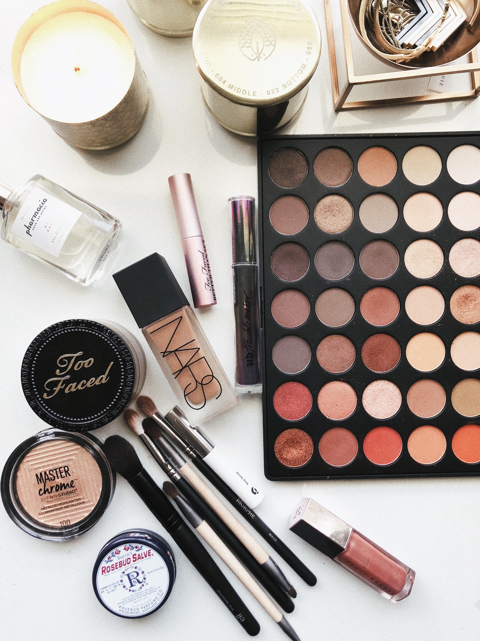
Photo by Jazmin Quaynor on Unsplash
Red is significant to the beauty/fashion industry because of its intensity and romantic connotations. Black shows elegance. Pink communicates femininity. Tan is particularly significant in the area of cosmetics because of skin products; it conveys a message of natural beauty. White communicates cleanliness and creates contrast.
Blue is specifically significant in men’s fashion, but is also common in women’s professional apparel.
LSTORE’s beauty graphics website uses red, black, pink, and tan.
Marketing
Blue, black, orange

Photo by Brooke Lark on Unsplash
In marketing, blue is used to communicate loyalty and trust, black conveys formality, and orange symbolizes energy and efficiency.
Barefruit Marketing‘s website uses blue, black, and orange.
Automotive
Red, yellow, white, gray, black, green

Photo by Alessio Lin on Unsplash
In the automotive industry, red represents boldness and intensity, yellow represents energy, white represents perfection and icy terrain, gray represents neutrality, black represents elegance, and green represents environmental awareness.
Cars & Coffee uses each of these colors in their website.
Sports
Red, blue, green, brown, black, white, yellow

Photo by Ruben Leija on Unsplash
In sports, red and blue represent classic opposing teams, green represents fitness and grass, brown represents dirt and footballs/basketballs, black represents intimidation, white represents field markings, and yellow represents substitute vests.
Nike uses all of these colors in their website.
Construction
Orange, gray, brown

Photo by Fancycrave on Unsplash
In construction, orange represents vests and cones, gray represents fasteners and tools, and brown represents wood, dust, and masculinity. Yellow and neon-green are also common for safety vests because of their brightness, but they’re a bit unsettling in web/app design.
NGC uses brown, gray, and orange in their website.
Real Estate
White, gray, blue, brown, green

Photo by chuttersnap on Unsplash
In real estate, white represents cleanliness and modernness, gray represents neutrality and objectiveness, blue represents trust and professionalism, brown represents wood and clay, and green represents nature.
Dock uses each of these colors in their website.
Bear in mind that each of these sets of colors are not confining – for example, if you’re making a marketing application and you don’t want to use orange, but you do want to use green, there’s no rule that says you “aren’t allowed” to do that. As a web/app designer, it’s up to you to discern which colors are appropriate for your project; these color sets function as templates or inspiration.
If you’d like to keep up with this series to get more tips, tools, and advice regarding color and design, as well as other developer insights, follow us on Twitter to get notified of new posts.